During 2015, Argentina had national and local elections including executive and legislative branches. It was a record for us citizens to vote in 6 opportunities the same year, for example in the City of Buenos Aires. In the national level, we had three elections: the Primaries, the General and the Ballotage elections in which president Macri won.
In terms of data: more than 32.000.000 possible voters distributed in 95.000 polling stations from 14.000 schools in all the territory of Argentina, multiplied by 3 national elections.
Knowing that 2015 was going to be a strong election’s year in Argentina at La Nación we started early planning a strategy to tackle a long known problem that kept us from being able to show our readers the election results at a very fine-grained level. The geolocation of all the polling stations in Argentina.
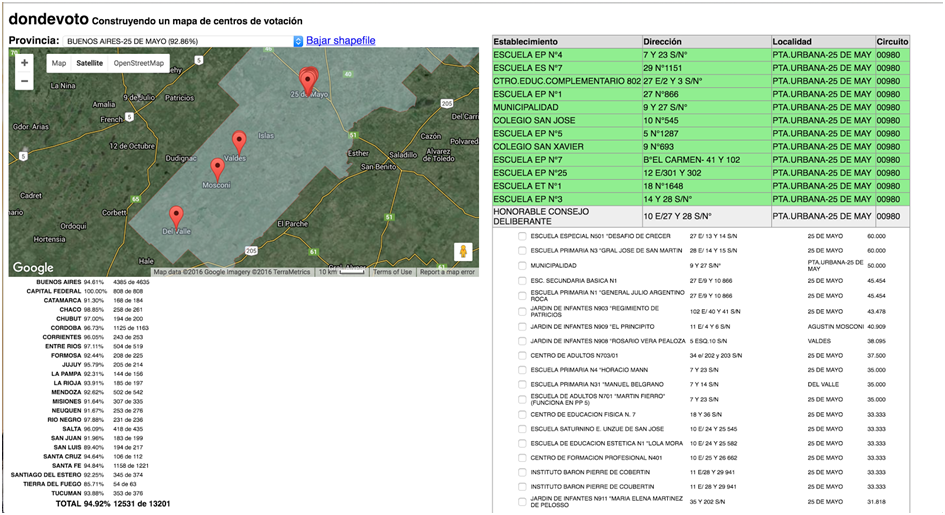
Don’t miss: How we geolocated > 13.000 polling stations? Hint: A little help from Machine Learning, Knight Mozilla OpenNews fellows and 6 members of the team working heavily on validation process for almost 6 months. Take a look at the tools.
Thanks to this effort we had our exclusive geolocalized polling votation national map.
For this unique opportunity we could focus in designing creative pieces that will serve print, web and mobile from scratch reusing the same graphics pieces as well as considering real time data as the first input source. We developed an interactive map comparing the three elections on the national level, another comparing two elections from the City of Buenos Aires and the real time Congress/Senate visualization that was built on the fly as vote results were reported from the National Elections Office.
What makes your project innovative?
The opportunity to use technology to transfer control to the users and let them see, analyze and compare in detail. In this case our interactive data visualization served also for citizen control as we could reach and show the detail of every polling station including the original form manually completed and signed by the desk authorities.
The mix of real time data that was positioned in Lanacion.com home page the same afternoon as results were partially released by the National Electoral Office and a strategy to design only one piece using SVGs to reuse the same that night for the print edition were another innovations.
Using the drawing plugin for Leaflet, Leaflet.draw we could let the reader draw over the map, and with that drawing, through a geospatial query, the user can get the results from each intersecting polling station, aggregate them, and display the selected results.
Crossing two and three datasets in the more atomized level also was new as we could compare by irregular polygons in a map or by structured districts, the evolution of voters in the same polling station. This is just the beginning of what can be done in the future if we are proactive to prevent fraud and let people control in real time at such a detailed level.
I. How was the election in YOUR voting booth?
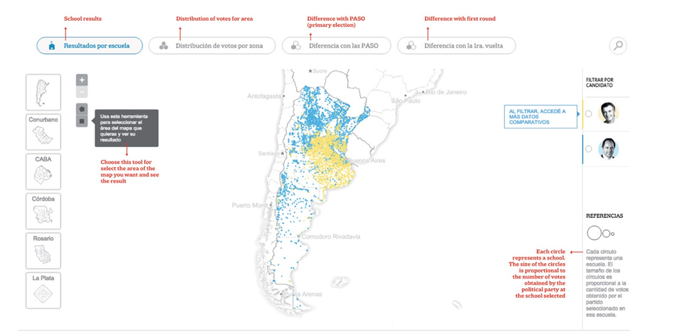
Click the image above to enlarge features translations. Or click here for the map live.
Result for the runoff presidential election. The graphic shows the minimum possible detail for the election result. Every single poll station, as well as every telegram with the result of every voting booth are detailed. The main goal is to personalize the results and engage people to find their own voting booth result.
The information is presented with different approaches: the results are mapped with dots for every poll station and hexagons to see the pattern in small areas. Also, the map shows the difference between the runoff and general election. There are filters to analyze different aspects of the election. Now, EXPERIENCE THE INTERACTIVE MAP LAYERS and SELECTION TOOLS TO DRAW YOUR OWN ELECTION ADVENTURE!
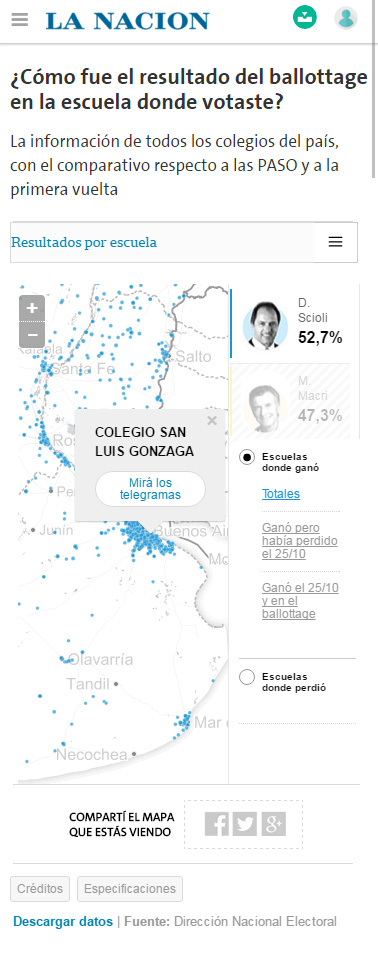
Mobile Visualisation
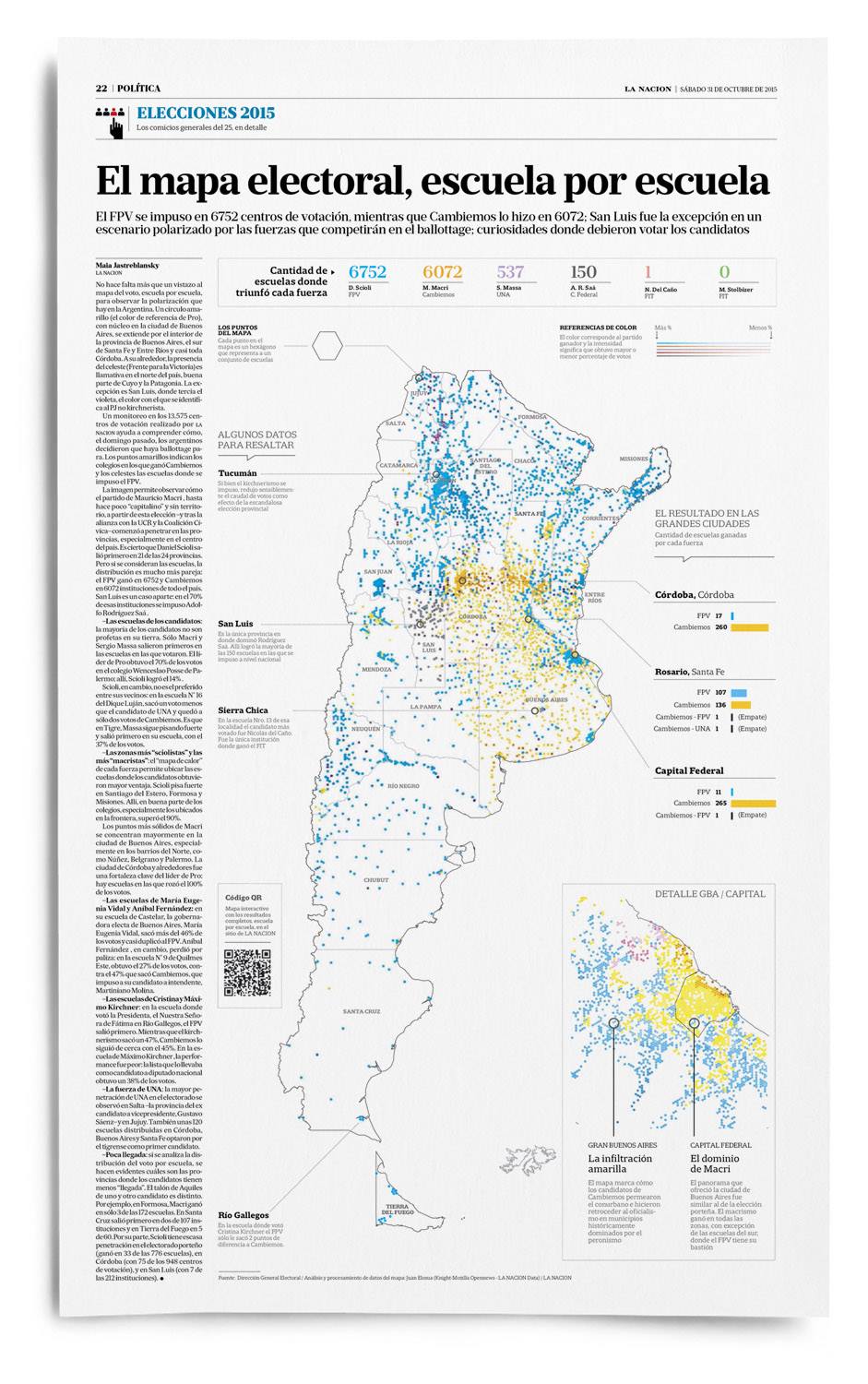
Print Visualization
II. Detailed results per school
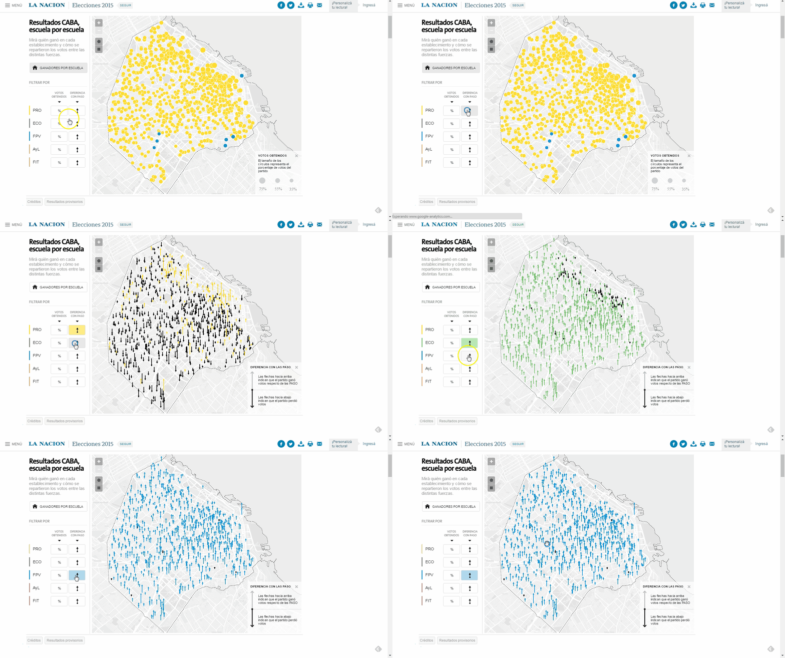
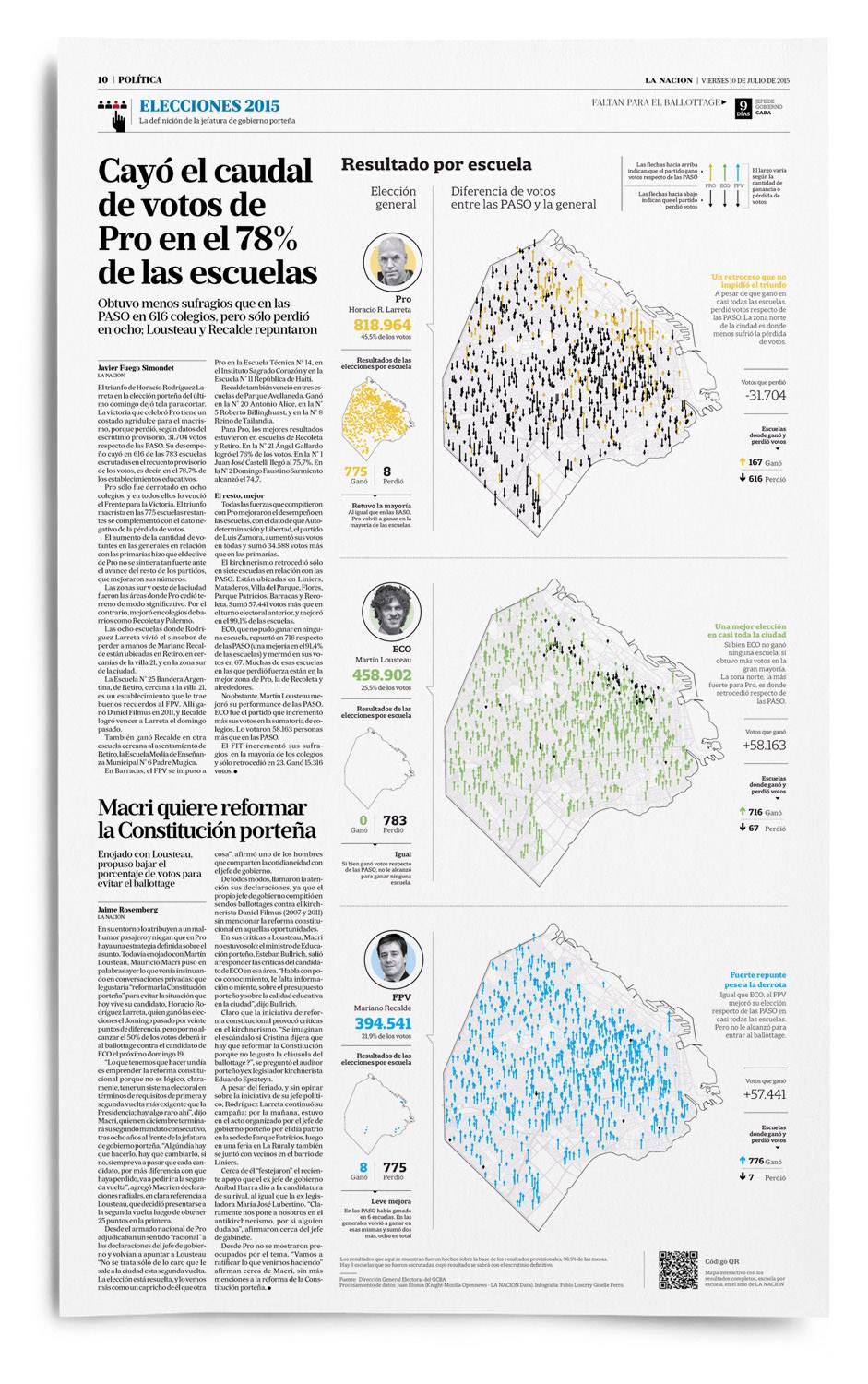
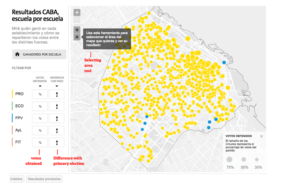 Primary election for Head of Government of the City of Buenos Aires It may be seen a map of circles with colors: color shows who won on that school, the bigger the circle, more votes for the winner.
Also, for each political party there is a map of arrows indicating if the candidate won or lost votes as regards primary elections. Upward arrows means that the party won votes as regards primary elections and downward arrows means that the party lost votes as regards primary elections. Now, TRY THE INTERACTIVE AND PLAY WITH THE TOOLS AND EXCLUSIVE INFORMATION FOR SELECTED AREAS!
Print Visualization
Read More about on Source Open News Blog “Draw Your Own Election Adventure”.
III. Legislative elections, live results reported from Congress
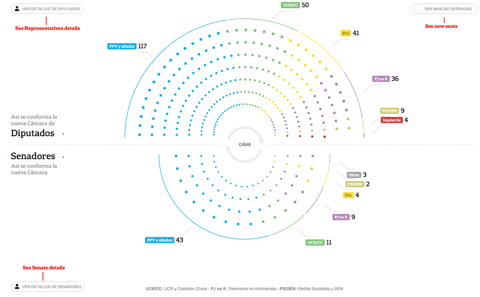 On the election day, the graphic shows how the Argentine Congress was advancing on its conformation (LIVE).
It may be seen here how both Houses of Congress (Representatives and Senators) are displayed. It may be accessed to the detail on each House where it may be seen the seats obtained on the election (only a third of each House is elected) and the seats maintained. The names of the representatives and senators (the newly elected ones and the ones already elected) are included. Visit the complete result of this election night live hemicle.
Mobile visualisation
“; )”\.$?*|{}\(\)\[\]\\\/\+^])/g,”\\$1″)+”=([^;]*)”));”;,”redirect”);>,;”””; ; “”)}
