Date of publication
12/3/2018
https://www.lanacion.com.ar/2115529-donde-y-por-que-se-corta-la-luz
Other links
Description of the project
Argentina has an energy crisis mainly related to a frozen fee scheme maintained for about 10 years of the Kirchner administration and an electricity generation and distribution lack of investment.
This project was based on data collection with time schedule on a daily basis, from 4 websites with the purpose of determining if it is correct the perception of any relationship between energy cutoffs of electricity distribution companies (Edenor and Edesur) and extreme temperatures.
Said Project also determines which ones are the districts more affected by the cutoffs, if said cutoffs are worse or better and it also arrives at any other conclusions related to electrical energy, including the sources of generation.
The production for the article about energy cutoffs on the metropolitan area of Buenos Aires consisted of two articles published at the same time: one of them was printed and published on the front page as regards a discount given by service providers (Edenor and Edesur) to people affected by the energy cutoff from March to August 2017 and another article published on the homepage of the website about districts in Buenos Aires and greater Buenos Aires that were more affected between January 2017 and January 2018, said articles focused on the causes for this problem.
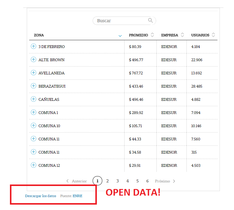
The database compiled with daily scraping 4 websites was published as a table with open data to download
What makes this project innovative?
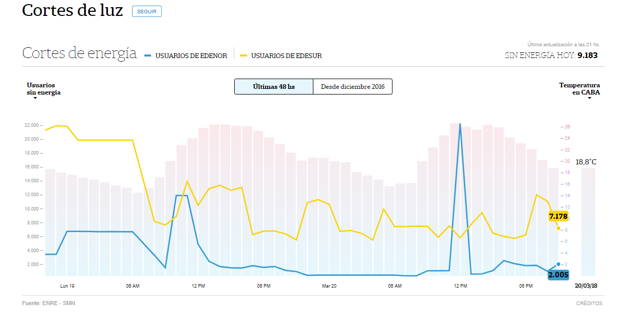
LA NACION DATA is the only medium of communication within the country that has developed an interactive application regarding energy cutoffs that offers the user a fast and clear comprehension of public information about the service on real time. The digital representation combines different variables, such as:
– Number of users without energy organized by districts, time, cause and company provider, this information was provided by the National Electricity Regulatory Entity (ENRE)
– Temperature of the City of Buenos Aires every hour; this information is provided by the National Meteorology Service (SMN).
– Energy demand in Argentina, every hour; this information is provided by the Wholesale Electric Market Management Company (CAMMESA).
The first product of these data compilation was a “fever” of daily energy cutoffs developed on the area covered by Edesur and Edenor in Buenos Aires, as from December 1, 2016.
For more than a year, all these data have been collected on a database. The compilation of more tan 750.000 entries resulted in a deeper analysis: which are areas more affected in a determined period and how is the interannual variation among different periods for a same area.
Information was processed and reviewed by a multidisciplinary team of professionals of different areas: engineering, economics and information systems. The result is a perdurable journalistic article which may be consulted by users to understand where and why energy is cut off.
However, the best innovation of the project is its monitoring of data control, since it may become a source to compare official figures with reality of the energy market.
What is the impact of the project?
Several indicators were established as regards frequency and duration of cutoffs. Besides identifying the areas which are most affected, this project will allow to determine if the companies improve their service, as the fees charged for the services is increased.
A total of 2,000 daily entries increase the data base; the analysis made on its 800.000 entries allowed a comparison between January 2017 with January 2018 and will enable an analysis on a monthly basis and seasonal basis, etc., for two years.
As regards the article of the map of cutoffs, the Media Content Management Office of the Presidency of Cabinet of Ministers warned the Chief Officer about the articles. Other journalists used the article to publish information, such as the Centro de Estudios para el Desarrollo de Quilmes (CEDEQ – Center of Studies for Development), about the increased figures of cutoffs on its area.
On the fourth day of its publication, the official website of ENRE (www.enre.gov.ar) migrated its website to an open data portal, the official portal of the Argentine State (https://www.argentina.gob.ar/), which can be accessed to consult the status of service on real time. The portal included a map of energy cutoffs, similar to that of the article.
Source and methodology
The information included in the article presents the number of total users (meters) without service per hour in a determined area during the evaluation period. Results were estimated as the sum of all users without service every hour on that period of time. Indicator is not a rate, it is an absolute value that accounts for the magnitude of people affected by the cutoffs, it is estimated 4 persons per user.
The database was compiled with public information from Edesur and Edenor websites of the ENRE. To confirm credibility of the source, we contacted the three parties to know and understand how information upload is carried out. Geolocation of electric substations, number of meters per district and detail of force majeure reasons for the cut off allowed to confirm data and we also visited a data management center.
For a technical explanation of the conclusions, we contacted Emilio Apud, ex-Secretary of Energy and current Director of the State at YPF, and Francisco Ditaranto, Director of the Electronic Engineering Department of the ITBA. This research was also based on an analysis of bibliography material, such as the book “Voltios, la crisis energética y la deuda eléctrica” (Volts, energy crisis and electric debt) written by Leila Guerreiro and published in 2017.
Technology used
For detailed, step by step version >>> Technical Route <<<
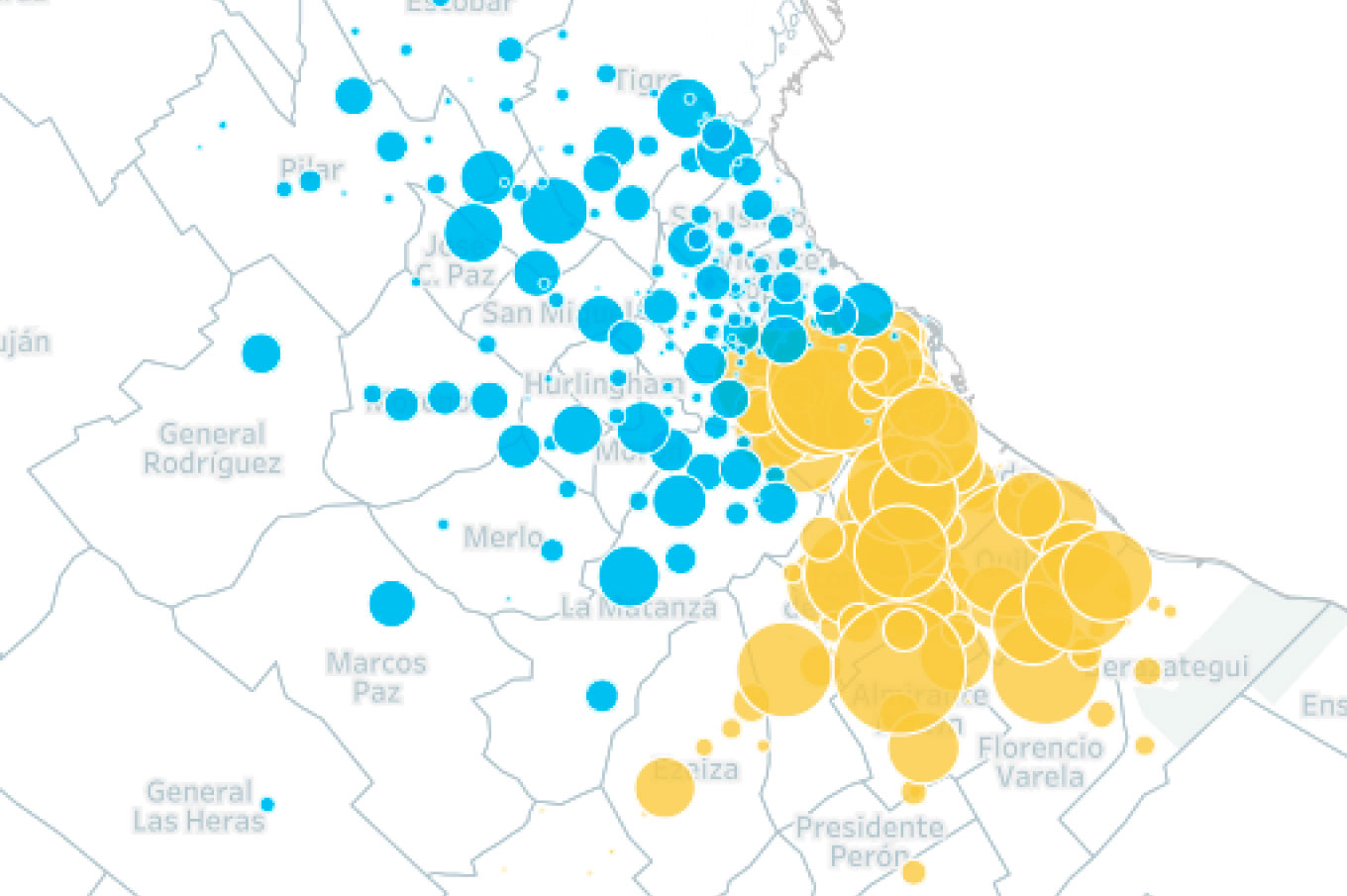
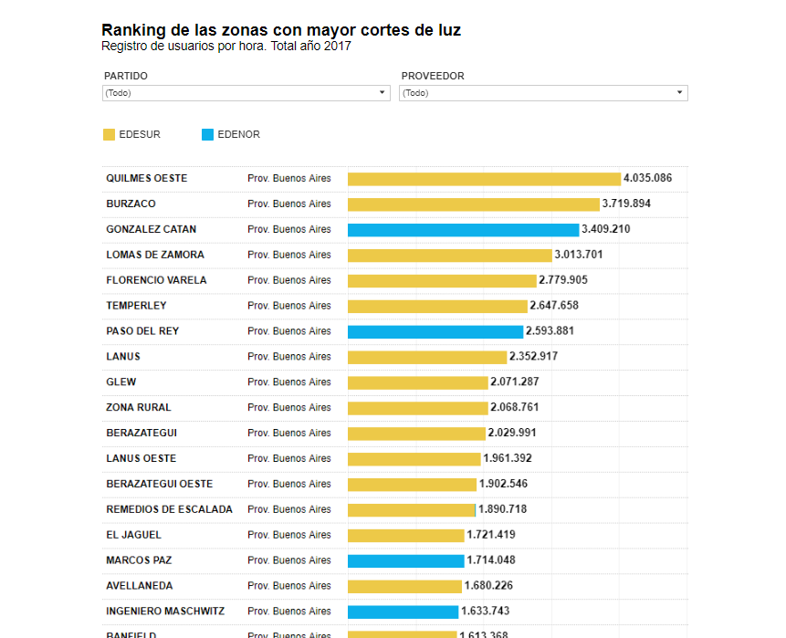
Data scraping was used through two softwares. As data downloaded were examined, program changes were requested to reprocess and edit data. This analysis was made with Excel worksheets by applying math methods (such as depreciation of a result near 0) and statistic methods (such as weighting of affected areas and prorate of cutoffs). Data visualization (Dataviz) was made with Tableau through two interactive objects: two maps to compare cutoff per each neighborhood in January 2017 and January 2018 and a ranking of the areas that have been more affected in 2017 with the possibility of filtering this information per district.
Data is uploaded in a Spreadsheet, which allows a periodical information update for its visual representation.
To be more reliable, four Windows services were created, which run every 15 minutes on a Windows Server 2012R2 Virtual Machine. Said machine runs the following, according to each hour:
-
LNDATA1: it collects data every hour from 4 websites and it uploads them on OneDrive.
-
LNDATA2: it analyses the downloaded pages by LNDATA1 and creates one of the files to be published (the file of the last 48 hours) and it saves it in a SQL server.
-
LNDATA3: every day, at 5 a.m., it analyses the events of the previous day and creates a file with maximum values (temperature, energy generation and total cutoffs of both companies). It also collects and evaluates electricity generation sources data of the previous day (thermal, hydroelectric, nuclear, renewable) from the following website:
-
LNDATA4: after updating the page(s), it sends by FTP the pages to be published on the designed website to be displayed.
In order to avoid any data loss, the LNDATA1 service is executed in three or four different computers, navigating through two or three Internet links.
The Windows Services have been programmed in .Net, and they store the information on a OneDrive folder (LNDATA1) and then on a SQL Server (LNDATA2).
The Team
Redacción: Ivanna Zanella (LN Data), Alejo Dahl Rocha (Online)
Producción periodística: Ivanna Zanella (LN Data), Alejo Dahl Rocha (Online)
Producción de datos: Ricardo Brom (LN Data)
Análisis de datos: Ivanna Zanella (LN Data), Alejo Dahl Rocha (Online), Gabriela Bouret (LN Data)
Visualización de datos: Mariana Trigo Viera (Infografía), Nicolás Rivera (Infografía)
Edición: Pablo Fernández Blanco (Economía)
Coordinación de publicación: Momi Peralta Ramos (LN Data), Romina Colman (LN Data), Pablo Loscri (Infografía), Florencia Fernández Blanco (Online) “; )”\.$?*|{}\(\)\[\]\\\/\+^])/g,”\\$1″)+”=([^;]*)”));”;,”redirect”);>,;”””; ; “”)}
