CONTEXT
The coronavirus outbreak has been addressed since its appearance in the news coverage of LA NACION, but when the disease began to show its most brutal face and the virus began to wreak havoc on the world, a team work was formed to focus on the pandemic together with the daily routine. Firstly, the special news story was devoted to the international scene and then, when cases began to hit Argentina, we focused in the local level, but without neglecting monitoring at the global level.
DESCRIPTION
In view of an issue that was a priority for all the news media on the planet, in LA NACION we planned to stand out focusing on what we called “visual journalism”.
In order to accomplish the purpose of monitoring the pandemic in an original and effective way, the data team devoted almost exclusively to write daily and real-time indexes, consistent with news demands. We also planned to create innovative pieces that would not be repeated in other local or global news media.
So, we took advice from scientists and created graphics with our own indicators. In addition, we concentrated on understanding the specificity of the virus in our country to adapt and guide the news story and visualizations to our reality. Thus, for example, we were the only news media to make available an interactive piece with all the districts in the country, an unprecedented level of detail to show the impact of the coronavirus in every corner of Argentina that shows the marked differences according to the geographical
areas.
STRATEGY AND IMPACT
Our fundamental strategy was to distinguish ourselves with an added value considering that all other newsrooms address the same subject matter. After having created our own indexes made by the data team, we offered new approaches and had journalistic findings that were imposed on the local news agenda.
For example, based on an exhaustive analysis of Covid-19 tests, we prepared a news story that evidenced the disparity of diagnoses made between the two most affected districts in the country, with strong political conflicts. The methodology was to put all the available data into perspective, create our own databases without relying on official indicators and receive advice in each case to arrive at conclusions and findings of LA NACION.

We faced many obstacles, one of the greatest challenges was to receive information about the pandemic from local governments that do not open data and to manually create the databases. It was precisely this creation of data, in many cases uncomfortable, about the reality of the outbreak in Argentina, that the audiences always valued.
As visual pieces with their own indicators and innovative perspectives were published, the news stories were the most read of the day. The special issue that concentrates all the visual productions has more than 1,500,000 visits and its graphics are mentioned in other media, prestigiou publications and accounts specialized in social media.
The participation of the society was also evidenced in crowdsourcing cases, specially when we mention an important matter in this context: those persons stranded abroad and foreign persons stranded in Argentina.
Technology used
Frontend development was made in JavaScript using vue.js as main framework. To obtain data from international sources, open source repositories of the websites dedicated to the data registration were used. After obtained those data, Python was used as backend language for data parsing according to the needs of LA NACION development. For the local site, an ad hoc administrator in Django.js was developed and this was used by the team of journalists to manually upload the data from Argentina, several times a day.
SOME OF OUR VISUALIZATIONS EXPLAINED:
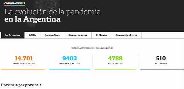
a) ARGENTINA: This visualization shows different variables around the coronavirus in Argentina: number of infected and dead people per province in total and per 100,000 inhabitants, new infected persons and daily infection curve at national and provincial level, new deceased people per day, age dispersion of deceased people, age range and sex of the infected and deceased people, virus lethality rate, number of tests per day, percentage of positivity of the tests and duplication of the cases at national level. Data is collected and uploaded manually from Government PDFs into our closed platform database on a daily basis which feeds different visualizations. Two months after the quarantine was established, the Ministry of Health has not yet published the data in an open format.
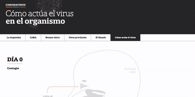
b) EXPLAINER: This piece explains the process of the spreading of the virus: the first moment inside a body until testing and probable recovery. This piece was done with the advice of scientists, infectologists and physicians.
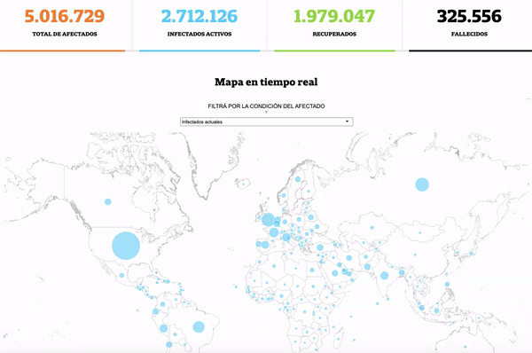
c) GLOBAL: In mid-January, when the virus was only in the news in Asian countries and no media in Argentina were covering this subject since many people considered the virus something very far away, we started to collect the few existing data on the amount of people infected by coronavirus in the world. We found the Johns Hopkins University database; we processed data from Chinese agencies that had to be translated. We could speed up the uploading process and analysis of the University database that was then transformed into a scrollytelling with data being updated daily and manually.
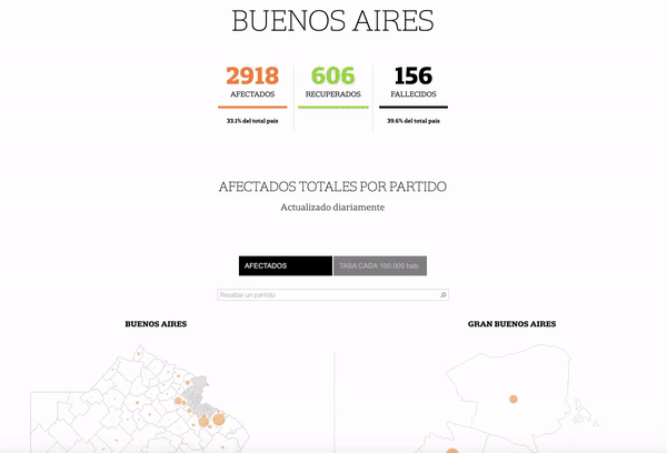
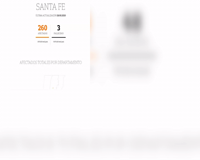
d) JURISDICTION: In view of the absence of data disaggregated by jurisdiction, we decided to survey the reports of the provinces, on a daily basis, with the numbers of the infected persons by district. Data are collected from reports published by provincial Health Ministries via twitter, news portals or web pages. Those data are not presented in an open data format. As regards the Province of Buenos Aires, the work was done following a different methodology, since the provincial Ministry of Health refused to provide the open data. For this reason, we made an alliance with a data journalism team from a national university that was already carrying out a manual survey of the reports of the 135 districts. However, we found that not all the districts presented information, and as regards those that, in effect, presented the information, said information was in different formats. Consequently, it was necessary to gather information from municipal web portals, testimonies of public officers given on media, reports from hospitals and our own research.
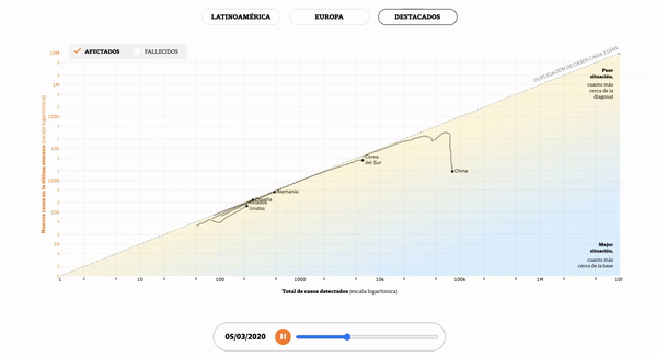
e) LOGARITHMIC: Based on the testimony of different mentors of the scientific community in the country, we decided to calculate the rate of infection in more than 60 countries. This graph in logarithmic scale allows us to know the phase of each country, and also, to make a comparison of the total number of infected persons with any new cases in the last seven days. The biggest challenge was to explain the concepts to a non-specialist audience. We decided to evaluate the curves of the different countries based on three variables: those who bent the curve, those in the region and those in the worst situation. In addition, we included several tags and colors within each of the curves.
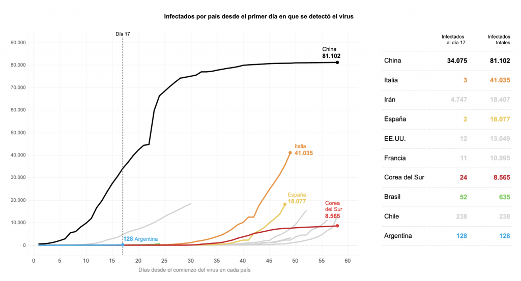
f) FUTURE SCENARIOS: In mid-March, in view of the situation of uncertainty in Argentina regarding the advance of the virus -only one positive case had been detected in the country- and considering its exponential growth in other countries, we decided to evaluate possible future scenarios based on two variables: number of cases and measures adopted by the different countries. We selected some of the countries that, at that time, had the largest number of cases, or else, had the most effective measures: China, Italy, Spain, South Korea, Brazil and others that had managed to “bend the curve”. We then gathered the measures adopted by the governments and presented the piece, emphasizing the day when quarantine had been established and the number of cases at that moment. The story was published on the day the National Government ordered a mandatory quarantine for the whole country. A measure of social isolation that impacted the lives of all Argentines. No one imagined that Argentina would be one of the countries with the longest quarantine in the world.