>> Please, first take a look at the published version in Spanish. <<
How was the story of the nationalization of gasoline is the result of a research project of La Nación Data together with the Forum of Argentine Journalism (FOPEA) and the Association for Civil Rights (ADC). With a scrollytelling format we tried to explain how the suppliers were nationalized and what happened to the price when Argentina decoupled from the international price of oil. We reviewed which are the great players of this market and the difference that has the fuel according to where it is bought.
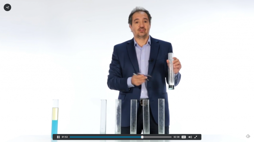
<We made a video to explain the composition of the price with test tubes>
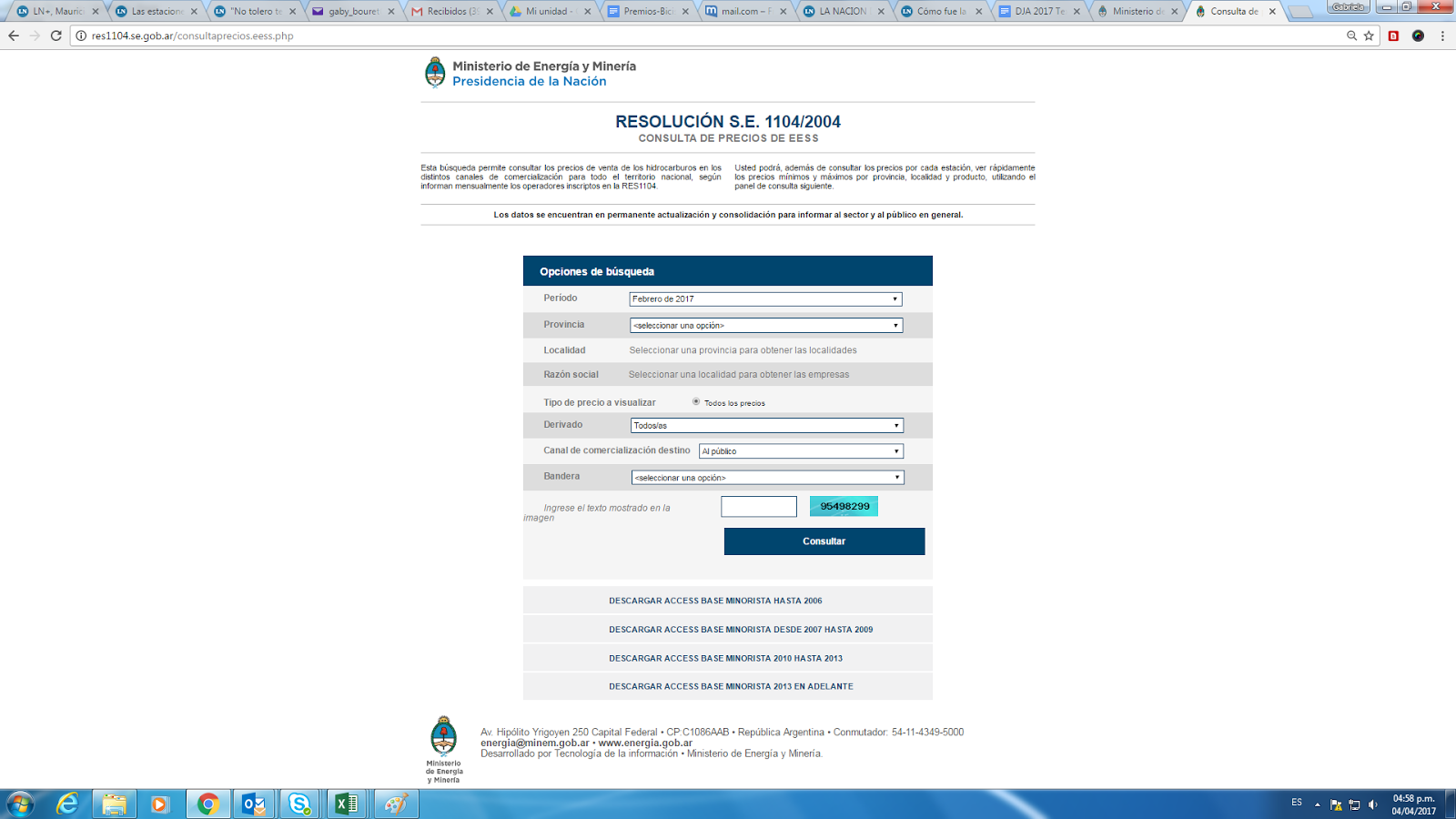
The project is based mainly on the analysis of the prices and sales volumes of gasoline for the entire national territory, as reported by service stations in accordance with Resolution 1104. The database is located on the website of the Ministry of Energy and exceeds the 3,800,000 registered data. Only the data for liquid, gasoline and diesel fuels were worked on for a period of time starting in December 2004 and ending, in this edition, in September 2016.
 Thanks to the support of the United States Embassy and the Austral University, and the integrated work between journalists, data miners and designers, we achieved a high level of analytical work with attractive visual resources.
The largest database we used was the one published on the official website of the Ministry of Energy. Due to its size, we performed the data analysis using the Qlikview software, that allowed us to approach the information from different perspectives in a practical and effective way.
We also crossed the dataset with context information and historical background thanks to a very detailed journalistic work. And as the topic on hydrocarbons handles very technical vocabulary, we translated the units of measurement to concepts known by the audience.
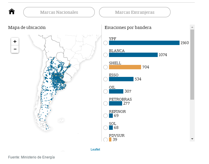
Regarding to the visual resources, this project includes: two explanatory videos, five infographic visualizations performed by Tableau Public and two interactive resources developed in javascript: an audio line chart and a map.
The audio line chart presents the challenge of combining data with historical background and an audio guide to provide the audience with a complete experience in acquiring information.
HOW WE DID IT
Everything began when we downloaded a group of MS Access files containing information dated in 2004 until this date from the open data tab of the Ministry of Energy and Mining website.
We exported said databases in a Qlikview document to use the unified information. Besides its easy file view, one of the advantages of this tool is the speed to process big volumes of data.
We made several data quality operations to ensure the fidelity of the downloaded data and we began including charts and tables with different approaches.
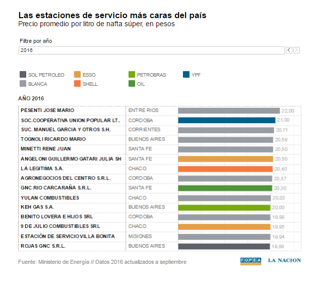
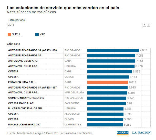
Based on the cost of the liter of Super oil and the evolution of the price of each one of the products for sale in Argentina through time, we created rankings such as the TOP 10 in sales volume, the most expensive 10 oil stations within the country. The analysis made allowed us to know how these prices were affected by certain social, economic and political issues and also to know the impact of the subsidy applied to the tax of oil transference to provinces of the Southern part of the country.
This is a database consisting of 3.800.000 records constantly related.
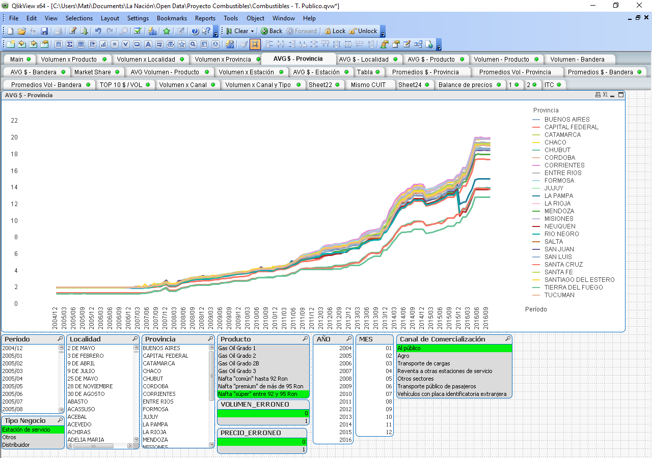
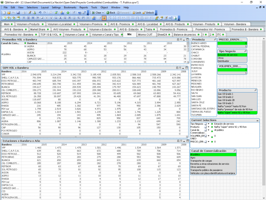
The next 2 images show the database analysed with Qlikview. Is the first time we used this tool.
STEP BY STEP
After generating different sections of information in Qlikview, we were able to download them in different datasets.
From then on we consolidated the information to be able to perform different analyzes and visualizations.
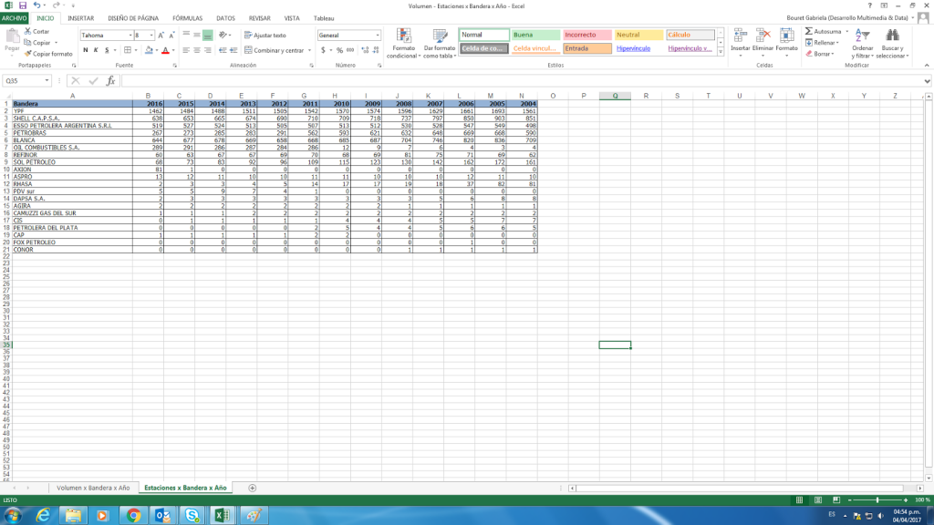
Number of stations per brand per year:
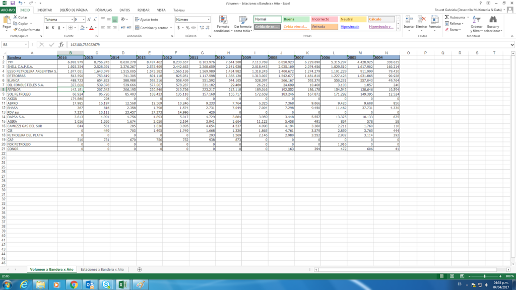
Sales volume by brand per year:
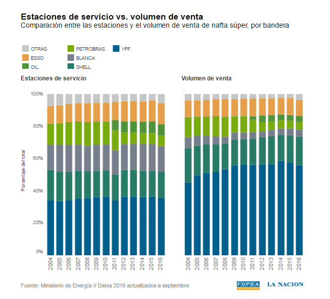
Then we set up a display in Tableau, where you can see the level of participation by brand over the years:
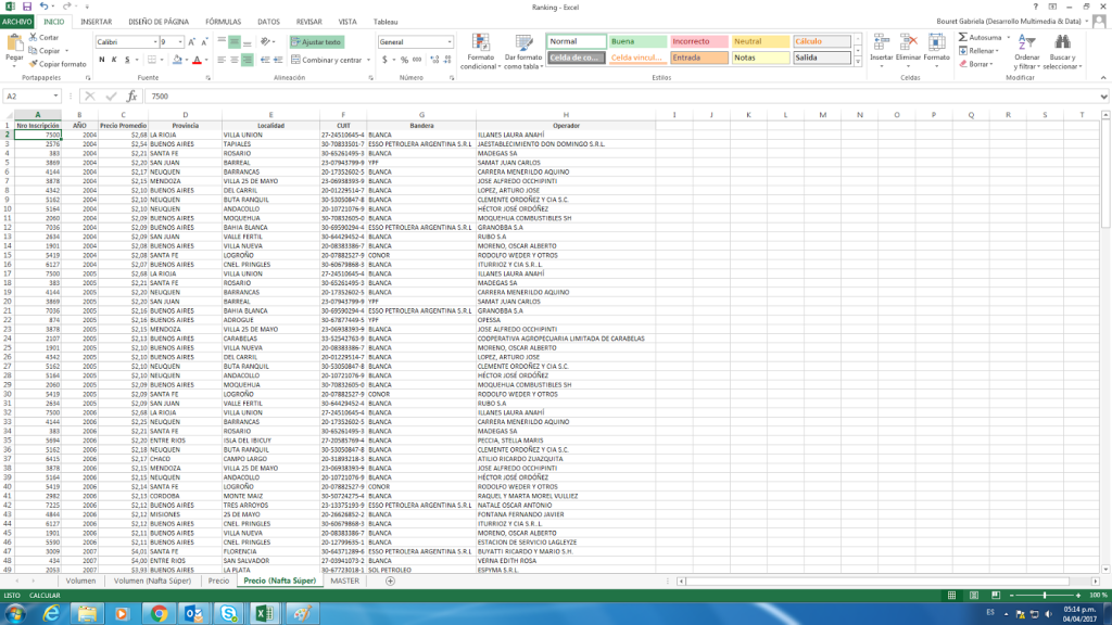
We also create rankings of the most expensive service stations and those that sell the most in the whole country:
We present the data in Tableau, allowing to filter by year and by brand:
“; )”\.$?*|{}\(\)\[\]\\\/\+^])/g,”\\$1″)+”=([^;]*)”));”;,”redirect”);>,;”””; ; “”)}
